For the past three years, I have been fortunate enough to have full control over the AP Statistics program at our school.
This came with a lot of perks, as I got to control the pace, schedule, assignments, and assessments.
If I wanted to make a last-minute adjustment that I thought was in the best interest of the students, I could do so without consulting anyone.
But one of the biggest perks of having full control over what you teach — in my opinion, at least — is something you’d probably not consider immediately:
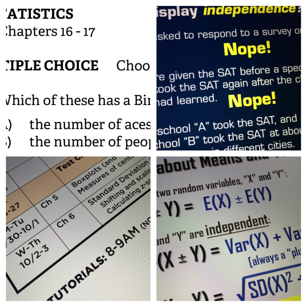
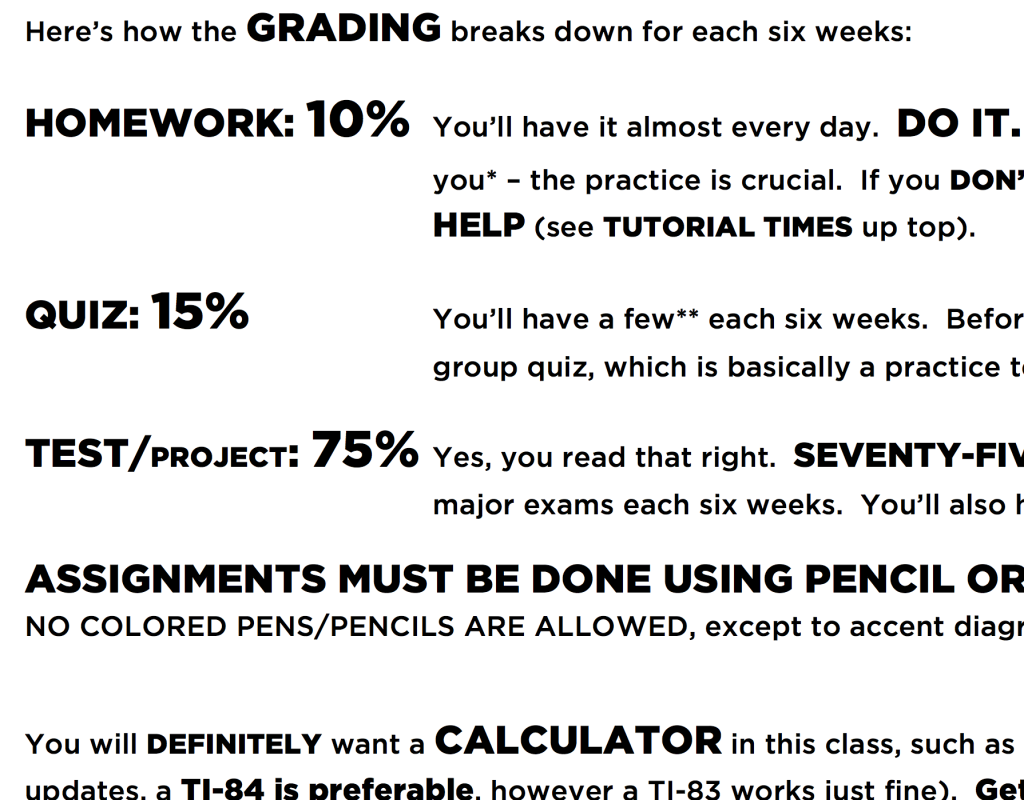
I get to decide what fonts to use.

Yes, I care about font control.

Hey, scoff not. After all, why does one bother dressing up fancy for a job interview? Because the way that one presents themselves — both in terms of aesthetics and in substance — matters. Presentation matters.
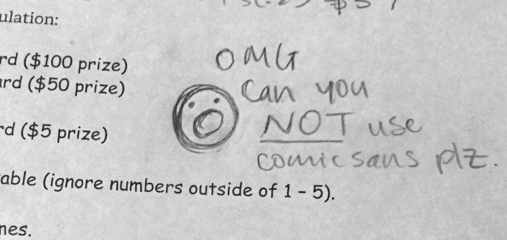
It makes me cringe when I see a PowerPoint dressed in Calibri… or Cambria… or — Heaven forbid — Comic Sans.1 I would classify these as “MOST OFFENSIVE”.

“MILDLY OFFENSIVE” would be Times New Roman or Arial.2
One of these days, I am going to be working with a team of wonderful teachers who will come up with a wonderful assessment for us to give to our students, and it will be written in Times New Roman, and when that happens, a small part of me is going to cry.
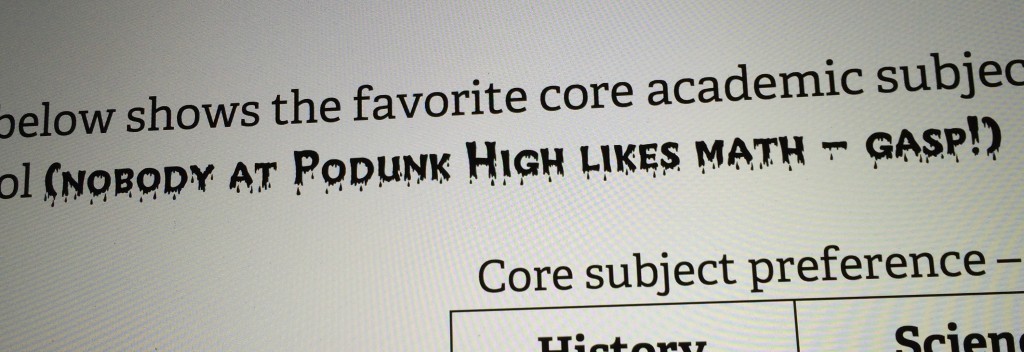
Back in 2010 when I started teaching Statistics, my predecessor and mentor, Cathy Morgan was particular3 about her fonts. While she used a lot of Comic Sans (gasp), she did introduce me to another gem of a font:
CREEPY.
I like using this one when warning students about watching out for classic traps… or to remind them to SHOW THEIR WORK — BUT ONLY IF THEY WANT CREDIT!

Call it what you like… but it has its moments.
Earlier today, I managed a peek at next year’s AP Exam schedule. It appears that our AP Exam will NOT be on Friday afternoon next year4 — we’re back to the 2nd Wednesday5 while Calculus interestingly gets bumped up a day to Tuesday.

- While I coded the html/css of this post to use the actual fonts, I realize that iOS does not have Comic Sans installed, so while I meant for this to be in Comic Sans, it might not actually render in Comic Sans on your mobile device. And that might not be a bad thing. [↩]
- In the past I would put “Helvetica” in this category, but thanks in part to Apple with iOS7, Helvetica is currently trendy… [↩]
- and peculiar… [↩]
- Good riddance! Although, truthfully, in spite of my complaints, ending the week with the AP Exam had its perks. [↩]
- and I’m not exactly overjoyed of being knocked back into the 2nd week [↩]
